New article on historical color photography and multimodal ML published in Visual Studies
I’m happy to announce that my new article - ‘Revisiting the Kahn collection: multimodal artificial intelligence and visual patterns of presence and absence in the Archives de la Planète, 1909–1931’ - was published in Visual Studies.
Please read the abstract (or the article of course) for more information. I’ve included some of the figures of the article, which highlight the most important conclusions.
Abstract Financed by the French banker Albert Kahn, the Archives of the Planet is one of the most important collections of early photography. Produced between 1909 and 1931, its 72,000 autochromes show a world we are accustomed to seeing in black and white, captured in colour. While Kahn focused on volume, scholars have mostly studied the collection by close reading a small number of pictures. In contrast, this article applies a distant viewing methodology – a combination of data analysis and multimodal AI – to examine, compare, and analyse all the thousands of pictures in the Archives of the Planet. Using spatial metadata, it reveals that the world represented by the collection is significantly smaller than previously assumed: only 22 countries appear more than 100 times in the archive. Applying multimodal AI reveals that a large proportion of the archive (∼25%) consists of the same or extremely similar images. Challenging previous claims about the collection’s heterogeneity, algorithmic clustering of the images demonstrates that Kahn’s photographers captured similar scenes, adhering closely to the scientific principles of the project. On a general level, the article demonstrates that a distant viewing methodology can help find patterns of presence as well as patterns of absence: the silent parts of the archive.
In the first part of the article, I use spatial metadata to examine where the 72,000 autochromes were taken. I argue that this helps us understand which “world” the Kahn collection shows: what parts of the globe become visible and which parts stay hidden.
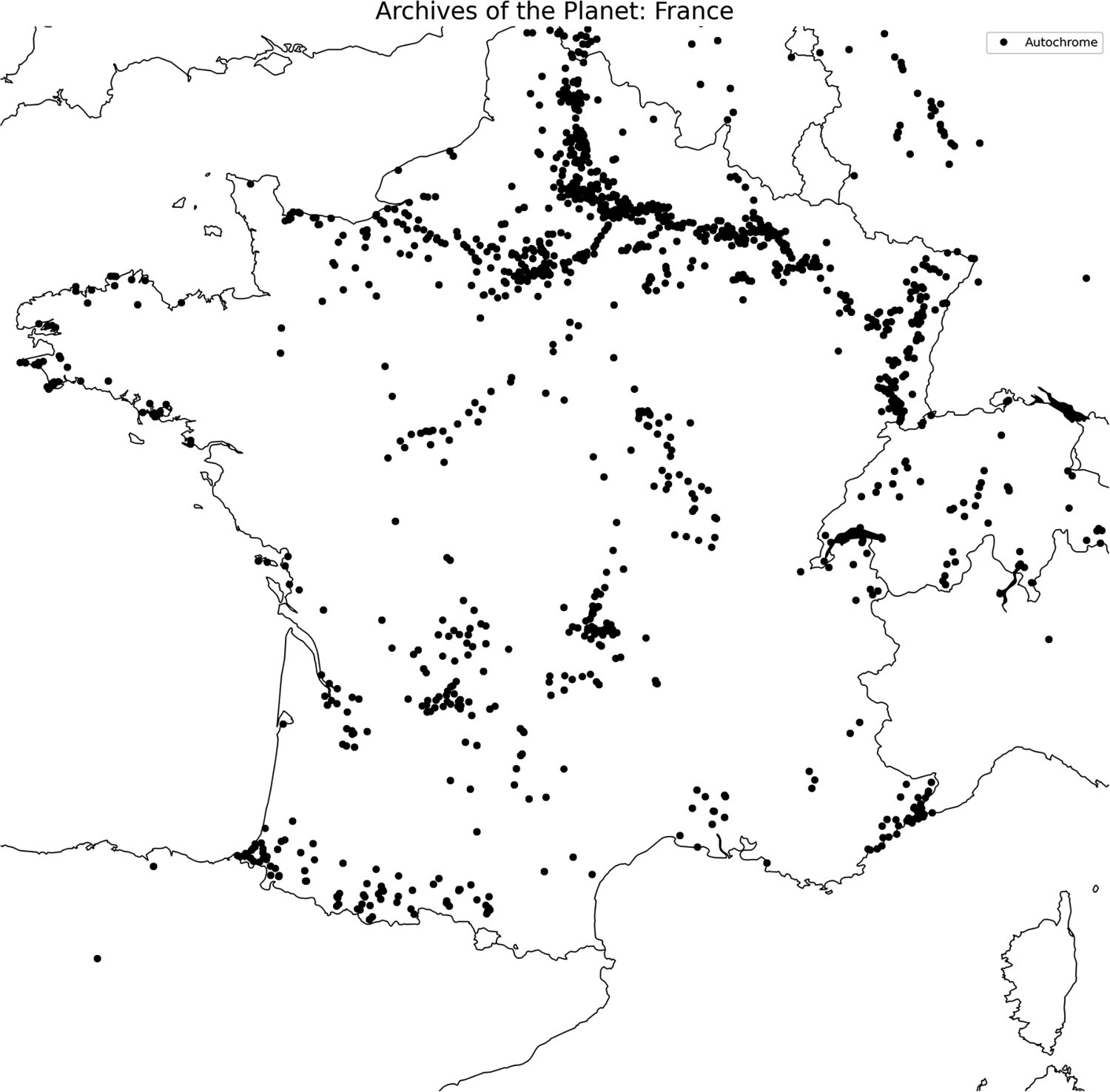
Figure 3 plots the autochromes of the collection on a map of France. The line in the north of France highlights the importance of several photographic missions that were meant to capture the destruction of the First World War. We might argue that these thousands of pictures do not adhere to the overall goals of the project.

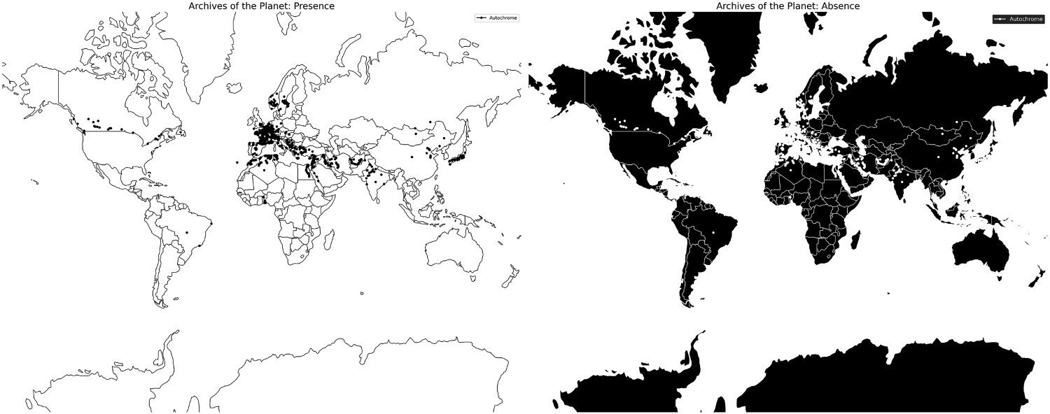
Figure 4 plots the autochromes of the collection on a map of the world. The article describes how this visualization highlights the survivorship bias of historical collections: we often solely base our findings on surviving data and ignore the silent parts of the historical archive.

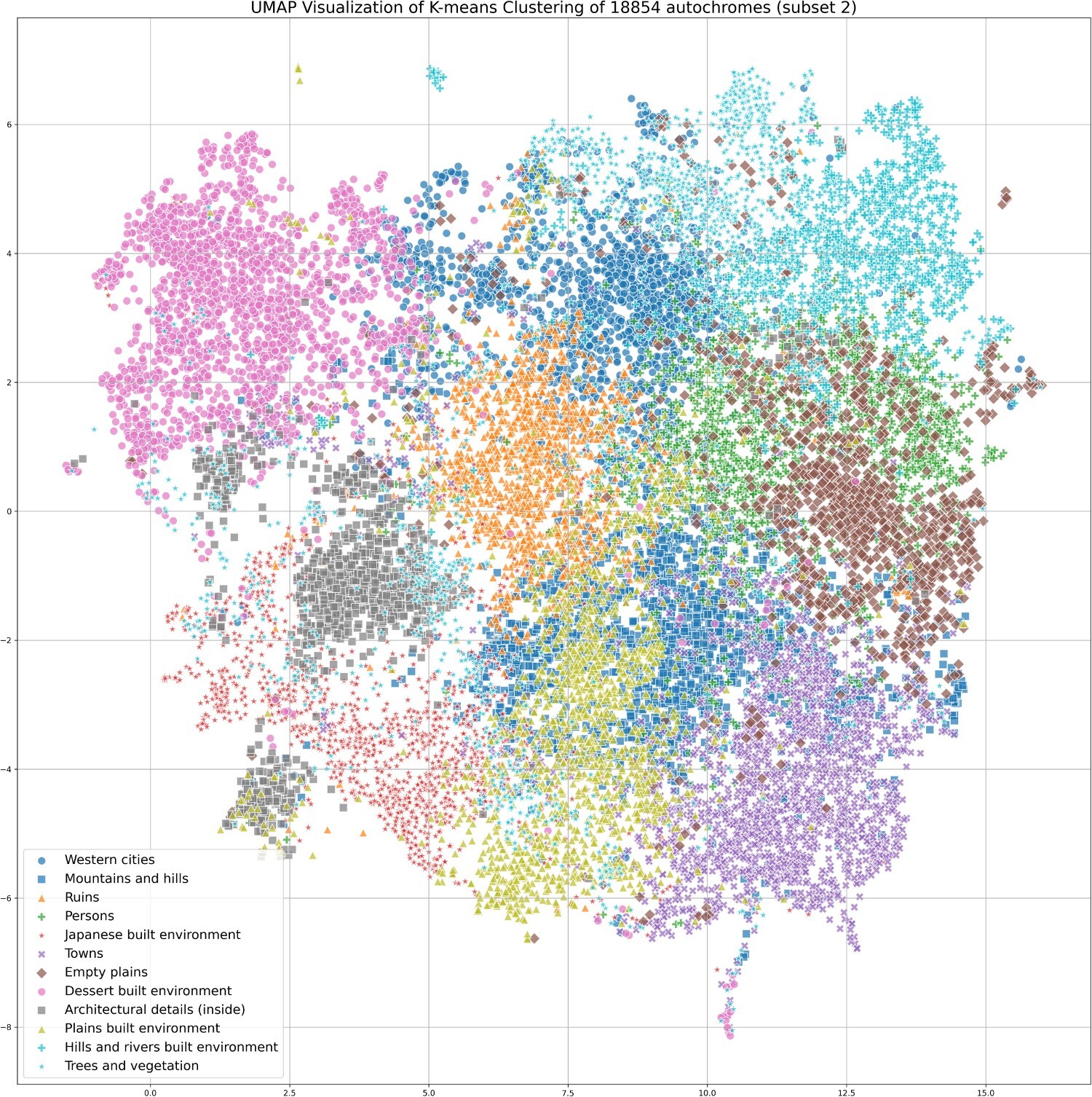
The second part of the article shows how we can use multimodal machine learning to cluster the autochromes based on visual similarity. Each point in Figure 6 represents an individual photograph, and these are color-coded into twelve distinct clusters as indicated by the legend.

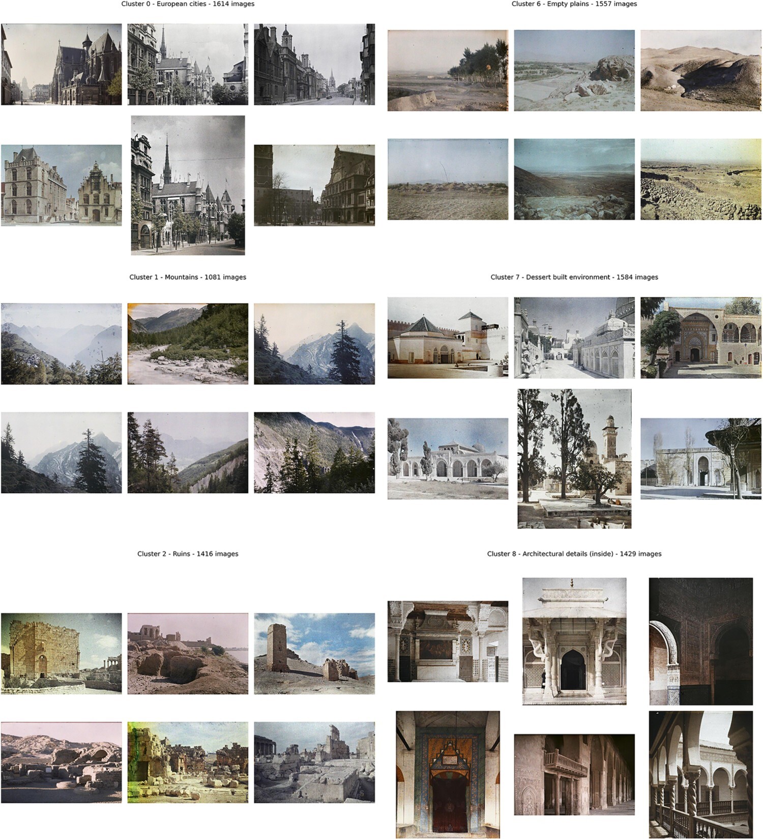
Figure 7 displays the 6 autochromes nearest to the 12 cluster centroids: the mean (average) position of all the pictures in a specific cluster. As mentioned in the methodology, the clusters are mathematically coherent, which does not necessarily mean that they reveal relevant or meaningful visual patterns for humans. However, inspecting the 12 clusters makes clear that all of them display a form of visual coherence. Based on the images in Figure 7, we can describe the 12 clusters as being focused on: Western cities, Mountains and hills, Ruins, Persons, Japanese built environment, Towns, Empty plains, Desert built environment, Architectural details (inside), Plains built environment, Hills and rivers built environment, and Trees and vegetation.
